
2018
UX/UI DESIGN Intern
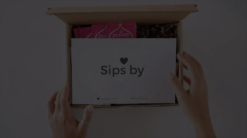
Sips By™
01. overview
Introduction
Sips by™ plays matchmaker for thirsty US Millennials and their penchant for craft teas, coffees, wines, and beers. Sips by™ is focused on evangelizing loose leaf tea to US Millennials via a brand-agnostic tea sampling subscription box and eCom platform.
A user would take a personal quiz that notifies Sips By what type of teas that specific user enjoys. From the quiz results, they would send the user 4 different type of teas that is personable for each user.
Challenge
Sips by™ wanted to revamp their UI Design and layout of their website.
More Users to Take the Quiz
One challenge was how to increase people to take the personal quiz so Sips By can send these users teas that caters towards their quiz results.
Customer Blog Engagement
Another challenge was increasing the engagement with the customer blog on the website with existing users who already signed up. The customer blog page gets lost and is difficult to find.
Solution
Quiz Before Signing Up
I researched what the best-in-class subscription services are doing on the homepage. With that being said, I noticed all these personalized subscription services have the user take the personal quiz FIRST and then, to see the quiz results the user would have to register for an account. But, Sips By would have people sign up first and then take the quiz, which probably makes the users less motivated to finish or even start the quiz.
Highlight Top 4 Blog Posts
I noticed it was difficult to find the customer blog page, and I thought it would be easier to have the customer blog page be the first thing a new or existing user see's once they signed up or signed in to their account. Sips By would have hundred of articles without a filter system, which looks super overwhelming to a user, so I thought it would be better to highlight the top 4 popular blog posts and have an option to "See All" blog posts if a user is super intrigued and wants more. Also, being able to filter the blog post by the type of tea or subject of the article would make everything easier for a user to find a specific blog post.
02. research
Competitive Analysis Conclusion
Sense of Community
I found out that many competitors had a large hero image on their homepage and as they scroll down they can see a brief summary about what the subscription company is about. Also, it was very community-based, meaning it showed customer reviews/experiences with the company and their instagram feed.
Call-To-Action
On the competitors homepage, as you scroll down there is a CTA (Call-To-Action) button that reminds a user to get a subscription (or in our case - to take the quiz).
Organized, Structured and Not Content Heavy
I researched how other subscription box services laid out their customer blog experience for their users. I noticed websites like, Ipsy, Birchbox, FabFitFun and Bustle had a clean grid layout for each article in their blog page. Also, that the content was not too text heavy and had a lot of fun illustrations, photography and minimal text. There was also an option to share an article to a user's social media page and also able to comment on an article for more engagement. Most of the competition highlight 3-6 blog posts and have an option to see more posts, so it was less intimidating and not content heavy for a user to lose interest.
Motivation to Take Quiz
Give Customers Characters
I noticed that Ipsy (a custom subscription box service for makeup) characterizes their customers with their skin tone, eye color, hair type, etc. I thought it would be a great idea, once a customer takes a quiz, that they are given different characters based off of their quiz results and what type of tea lover they are. If this was displayed on the homepage to show which "character" or "tea type" they are, maybe it will motivate new users to take the quiz and register for an account after.
New User Flow
Since we know the possible solutions for more users to take the quiz and register for an account, I thought it was important to create a new user flow to show the steps a new user would take from taking the quiz, registering for an account, getting a subscription and finding the customer blog.

03. design
Low-Fidelity Wireframes
I developed low-fidelity wireframes for their website. They wanted me to revamp the homepage for new users, change their "my sips" and tea profile page for existing users and their customer blog page.

High Fidelity Wireframes
Once we agreed on the structural look and feel of the websites from the low-fidelity wireframes, it was time to add color and photographic elements. Since I am also a photographer, they wanted me to take pictures for the website. For the color choice, they had a millennial pink color and wanted something more gender-neutral so I decided to use a green tint color thats a bit toned down.
